Have you ever noticed that some outfits instantly stand out while others feel flat, even when the pieces themselves are beautiful? The difference often comes down to complementary colors—a principle from color theory that stylists and designers use to create contrast and visual energy.
The idea comes from the color wheel, a chart that shows the relationships between colors. The color wheel organizes hues into a circular spectrum and helps artists and designers identify color combinations that work well together.
On the wheel, complementary colors sit on opposite sides. Pairings like blue and orange, red and green, and yellow and purple create high contrast, which makes both colors appear brighter and more vibrant. That visual tension is often what makes an outfit feel polished and memorable.
In modern styling, complementary colors in fits rarely appear as two loud shades competing for attention. Instead, stylists play with different shades, tones, and saturation levels. A smoky teal paired with burnt orange, or navy blue styled with amber accessories, delivers contrast while still feeling refined.
Complementary color schemes are just one part of color theory, which helps guide everything from fashion to interior design. Once you understand how the color wheel works, creating dynamic color pairings in your wardrobe becomes much easier.
The Color Wheel Explained: Understanding Color Harmony and Color Matching
Before diving into specific outfits, it helps to understand how the color wheel organizes color relationships. The wheel begins with the three primary colors: red, blue, and yellow. These form the foundation for every other color combination.
When two primary colors mix, they create secondary colors such as orange, green, and violet. Combine a primary and a secondary color and you get tertiary colors, including red orange, yellow green, blue violet, and red violet.
These relationships determine how color harmonies work. Color harmony describes combinations that feel balanced and visually pleasing, while color matching refers to the way individual colors interact in an outfit.
The color wheel also divides hues into two emotional families:
-
Warm colors: red, orange, and yellow
-
Cool colors: green, blue, and violet
Warm colors tend to feel energetic and bold, while cool colors feel calming and sophisticated. Pairing them across the wheel creates a sense of tension and balance that gives complementary colors their distinctive impact.
Stylists often use digital tools like a color picker or palette generator to explore these relationships. These tools help identify color pairings and complementary tones that feel cohesive. They are especially useful when building a wardrobe around a specific base color, such as navy blue, olive green, or camel.
Understanding the color wheel also makes it easier to avoid common styling mistakes. For example, pairing two colors that sit too close together on the wheel can sometimes feel muddy unless they’re part of an analogous color scheme. Meanwhile, using too many unrelated hues in a single outfit can disrupt color harmony.
The general rule many stylists follow is simple: limit your outfit to three colors or fewer, excluding neutral colors like black, navy, brown, tan, camel, olive, or grey. This keeps the look cohesive while still allowing bold color choices.
The Core Complementary Pairings for 2026: Best Color Combinations to Try
Complementary colors appear across fashion every year, but the way we wear them evolves. In 2026, stylists are leaning toward sophisticated contrasts, using muted tones, jewel tones, and layered textures rather than pure primary shades.
Here are three of the most stylish complementary color pairings this year.

Blue and Orange: The Electric Pair
Few color pairings feel as striking as blue and orange, one of the most recognizable complementary color combinations.
The reason it works is simple: cool blue balances the warmth of orange, creating a powerful visual contrast. The combination appears everywhere from sports uniforms to cinematic lighting because the two colors enhance each other’s intensity.
For fashion in 2026, the pairing feels more refined when worn in layered tones. Think navy blue trousers with rust-orange knitwear, or a smoky teal blazer paired with tangerine accessories. These variations maintain the high contrast effect while still feeling wearable.
The pairing also works beautifully with neutral colors. A navy suit styled with a burnt orange scarf or handbag can add dimension without feeling overly bold.
Purple and Yellow: The Royal Pair
Another classic complementary pairing is yellow and purple. On the color wheel, these opposite colors create a vibrant contrast that feels energetic and confident.
Modern versions lean into softer tones rather than bright primary colors. For example, a butter yellow blouse paired with grape-colored trousers creates a striking yet elegant outfit. Jewel tones like amethyst, marigold, and gold add richness to the combination.
This pairing also works well for color blocking, where large sections of each color appear in separate garments. The result feels graphic and contemporary, especially when balanced with neutral accessories.

Red and Green: The Organic Pair
Many people avoid red and green because they associate the pairing with holiday colors. In reality, this complementary combination can look incredibly sophisticated when styled correctly.
The key is choosing different shades of each color. Instead of bright red and bright green, try deeper tones such as cherry red shoes paired with an olive green dress or burgundy knitwear with jade trousers.
Muted or darker versions of complementary colors create a more wearable everyday look. This approach avoids the festive effect while still maintaining strong color harmony.
Three Ways to Style Complementary Colors in Fits
Once you understand the theory, the next step is applying complementary colors in ways that feel natural and polished.
The “Pop of Power”: A Beginner Approach to Color Matching
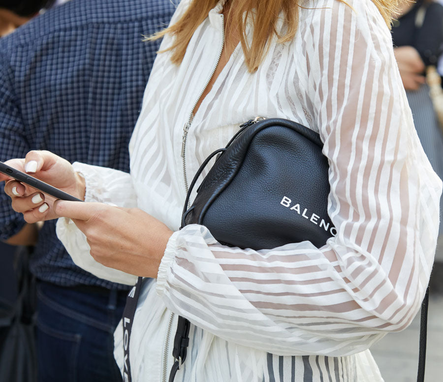
The easiest way to experiment with complementary colors is through accessories. Start with a neutral outfit—perhaps a blazer, blouse, and black jeans—and add small accents that introduce contrast.
A navy outfit paired with orange sunglasses or a cobalt handbag instantly creates visual interest without overwhelming the look.
Glamhive stylist Katherine Swallow often recommends this approach for clients experimenting with color. As she explains, “Accessories are the easiest way to experiment with complementary colors without committing to a full garment — add in a statement belt, necklace, earrings, bag, shoes, etc.”
The 80/20 Rule: Balanced Color Pairings
A more advanced approach is the 80/20 rule. One color dominates the outfit, while its complementary tone appears as a smaller accent.
For example, a forest green dress could serve as the base color while a ruby belt or handbag provides the contrasting hue. The look feels balanced because the dominant shade anchors the outfit.
Some stylists also adapt the 60-30-10 rule, which uses a primary base color, a secondary color, and a neutral accent. Both methods ensure that complementary colors remain intentional rather than chaotic.
Bold Color Blocking: High-Contrast Style
For those comfortable with strong color statements, color blocking offers the most dramatic way to wear complementary colors in fits.
Color blocking involves wearing large sections of each color in separate garments. A cobalt blue blouse paired with orange trousers, for example, creates a striking visual statement.
Temperature, Tone, and Texture: The Details That Make Color Work

Even the best color combinations depend on nuance. Temperature, tone, and texture all influence how colors interact in an outfit.
First, keep colors within the same tonal family. If one shade is muted or dusty, the complementary tone should also be subdued. Pairing a neon orange with a faded blue can disrupt color harmony.
Second, use neutral colors to ground bold pairings. Shades like camel, espresso brown, slate grey, and navy provide visual breathing room when two strong hues appear together.
Texture also plays an important role. A matte wool sweater paired with a glossy silk skirt adds depth that simple color matching cannot achieve.
These subtle details are why stylists often build entire wardrobes around a cohesive color palette. A curated palette ensures every piece works with the others, reducing decision fatigue when creating outfits.
Why Work with a Color Specialist
While color theory provides a helpful framework, personal coloring plays a major role in determining the best color combinations for each individual. Skin tone, hair color, and undertones can influence whether someone looks better in warm colors like rust and mustard or cool tones like lilac and navy blue.
Glamhive stylist Sharon Warten reminds clients not to overcomplicate the process: “I always tell clients: don’t overthink it. You don’t need a formal color analysis to look polished in color. If there’s a shade you love that doesn’t feel perfect on you, we can still use it — maybe on the lower half, in shoes, or as an accessory.”
Working with a stylist can also help translate color theory into everyday outfits. Through services like Glamhive personal styling, clients can develop a cohesive color palette that makes getting dressed easier while still feeling polished and intentional.
Confidence Is the Final Layer
Understanding complementary colors in fits gives you a powerful new way to approach getting dressed. The color wheel becomes less of a design tool and more of a style map, guiding you toward color combinations that create contrast, balance, and energy.
Start with small experiments. Pair olive green with burgundy. Try blue green with copper accessories. Introduce yellow accents into a violet outfit. Over time, these combinations become second nature.
Color is one of the most expressive tools in fashion. When you understand how complementary tones interact, you can build outfits that feel intentional, confident, and visually memorable.